mother mary
brand identity
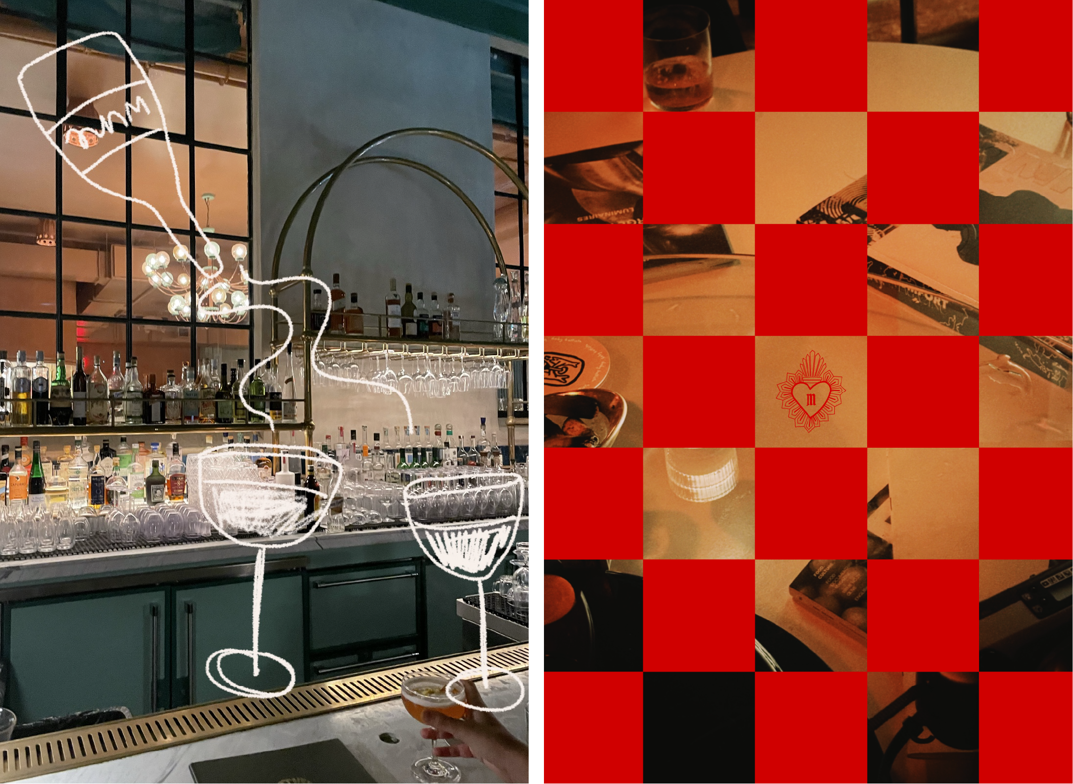
Brand identity for a cocktail and wine bar located inside an abandoned Catholic church. Pulling inspiration from Catholic art through the Renaissance, Baroque, Gothic, and the Dutch Golden Age periods, Mother Mary is an irreverent nod to the culture that raised me.
my role: concept, branding messaging, art direction, design, illustration, photography (vintage images sourced royalty-free)
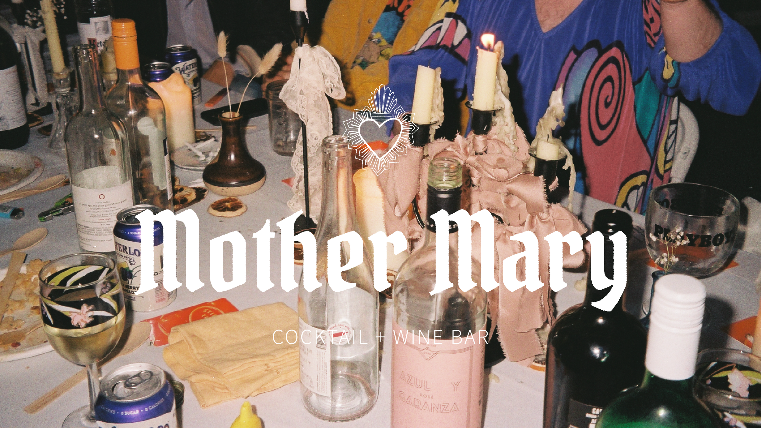
Nestled in a historic neighborhood, an abandoned Catholic Church is born anew – resurrected if you will. Mother Mary is a cocktail and wine bar where ritual meets revelry and communion meets community.
We believe, as good Catholics do, that good food, good wine, and good art is a salvation for the soul.
We also believe in a little irreverence and debauchery.
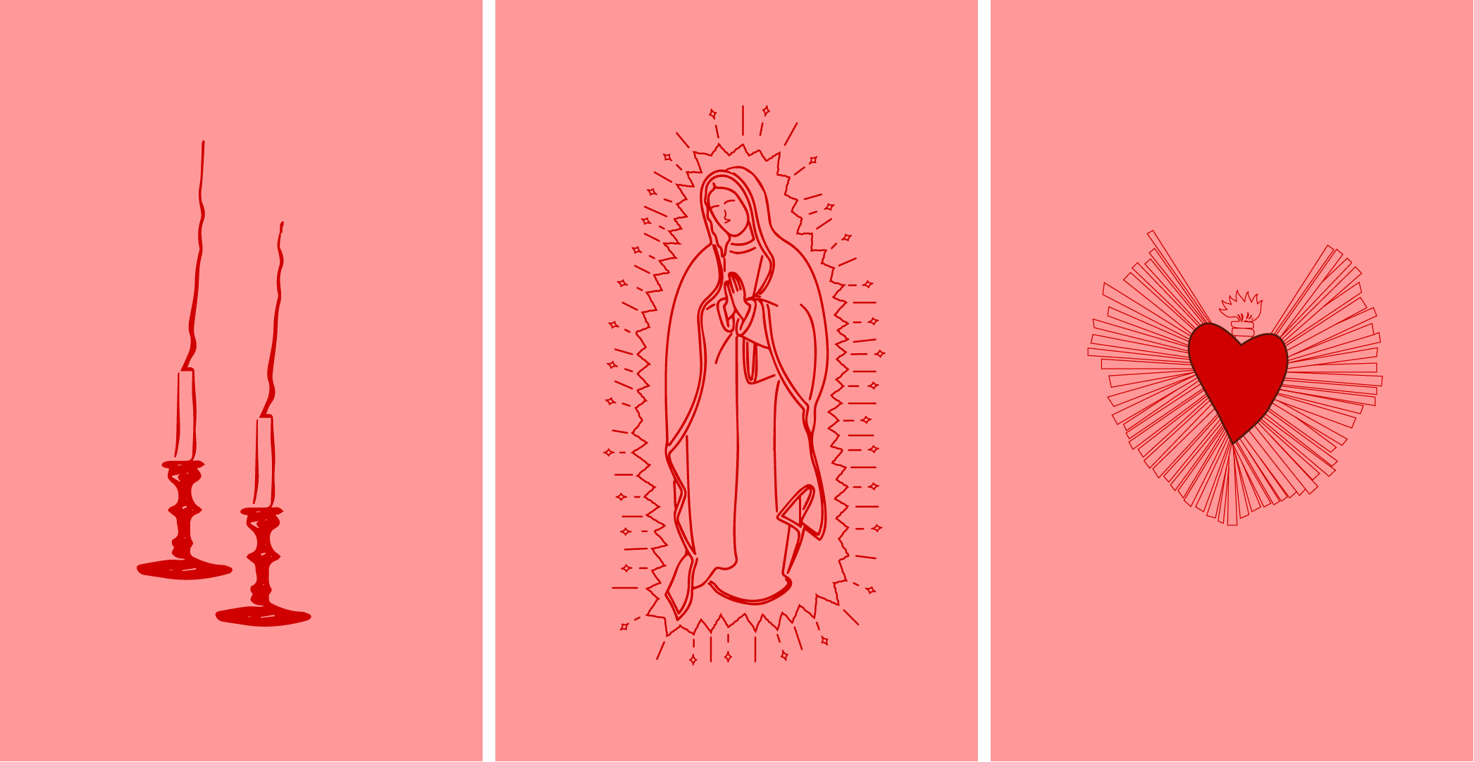
Just like in the Catholic Church, tokens and symbols have power.
Mother Mary’s branding is meant to extend beyond visual identity to physical touchpoints that customers can carry with them.
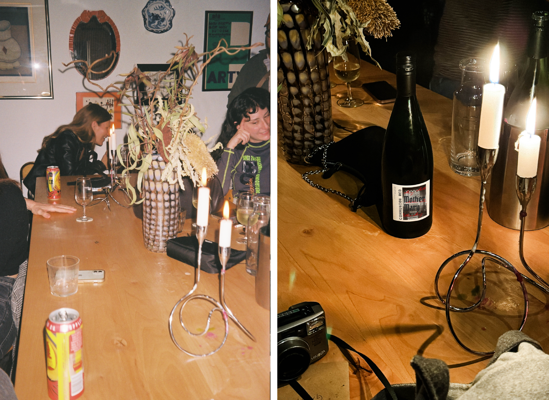
8x11 cm print-ready wine bottle labels
I’ve collected matchboxes for years and was excited to include some match designs for this project. I used my own collection for research and inspiration in design and specs.
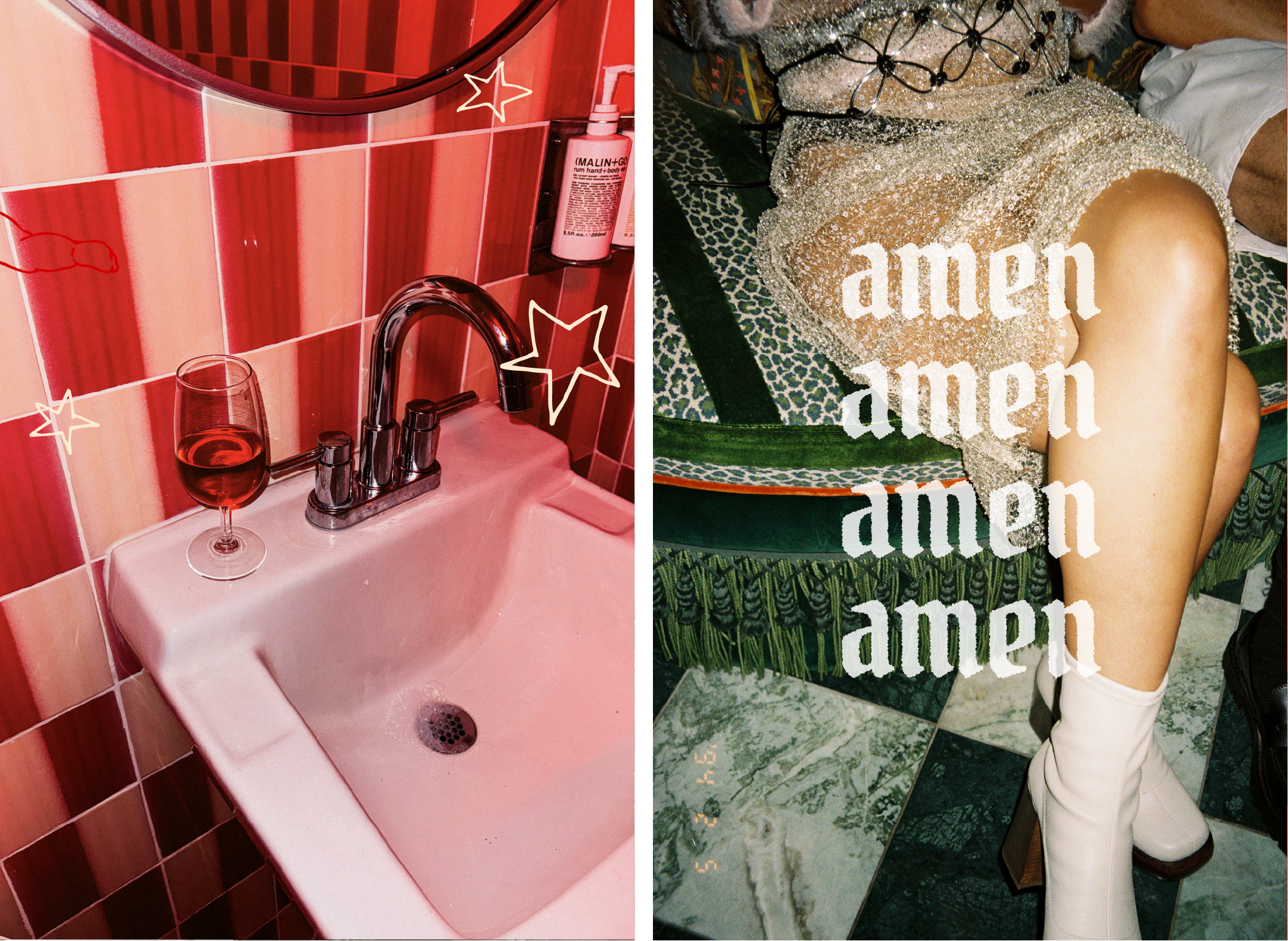
I chose a combination of vintage and produced imagery as a nod to the long history of the church and its traditions. Mother Mary’s brand story is both grounded in and a push-back to those traditions.
coaster design process
printed on pulpboard
